InnerSpace
InnerSpace is a digital concept that uses AI and machine learning to help students better understand, track, and overcome symptoms of Impostor Syndrome (IS). Our goal was to design a supportive experience that feels personal, approachable, and grounded in real user needs.

Solution Type
Mobile App
Duration
2 months
Team Size
4 team members

Figma

Notion

Miro
Challenge
How might we use AI and machine learning to create a digital solution that helps students recognize their IS patterns, manage symptoms, and build healthier coping strategies?
My Role
I worked as the UI/UX Designer and Project Manager, responsible for leading the design direction, coordinating the team, and ensuring we delivered a cohesive, human-centered experience.
My work included:
Conducting research, synthesizing insights, and shaping user needs
Leading concept development and structuring three design sprints
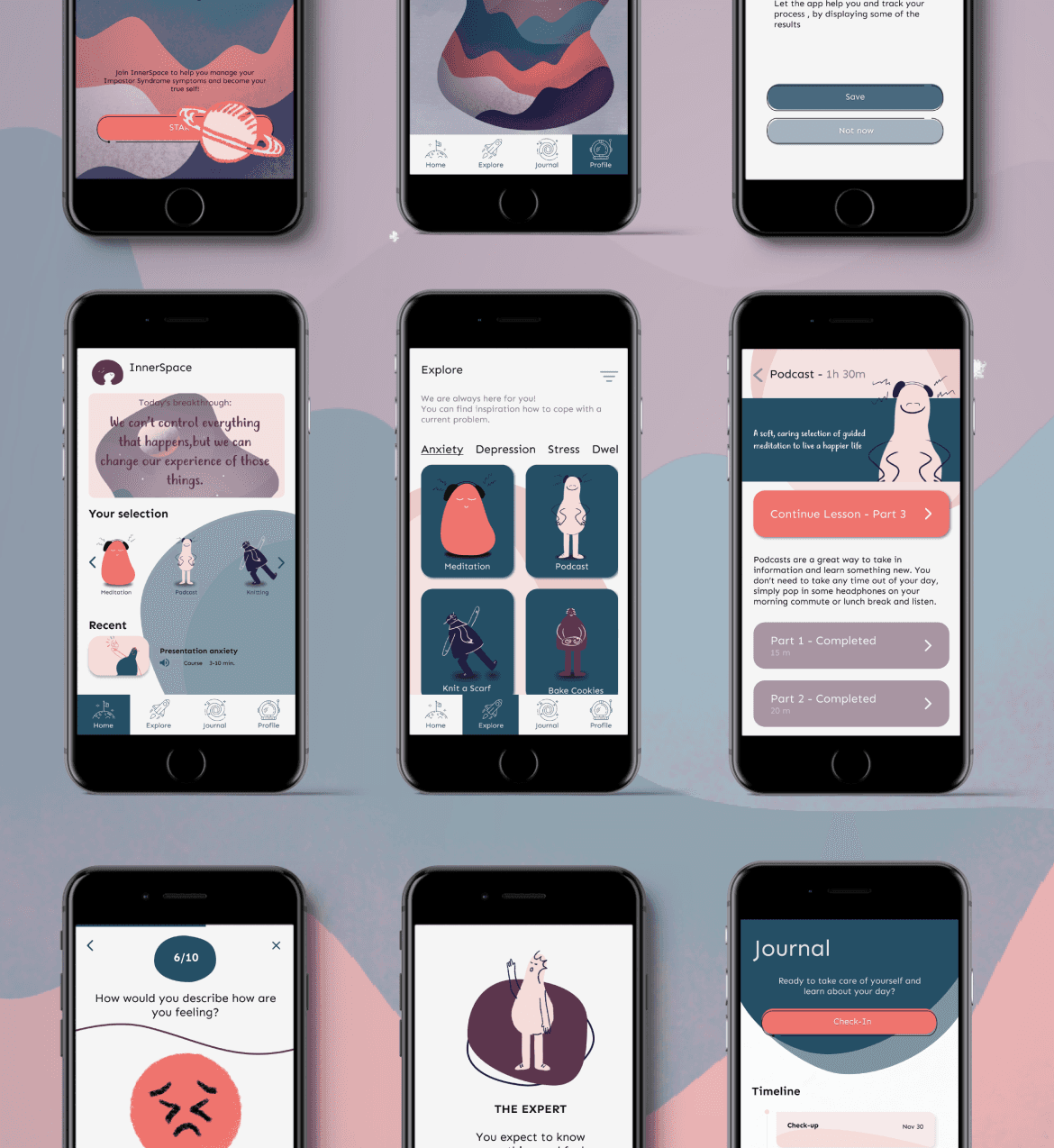
Creating user flows, wireframes, and high-fidelity UI screens in Figma
Building and testing prototypes (paper → mid-fi → hi-fi)
Collaborating on the machine learning model and integrating AI feedback loops
Managing cross-team coordination, sprint planning, and delivery timelines
I ensured design decisions aligned with user needs, emotional safety, and the functional capabilities of the AI model.
Result & Impact
The concept testing showed strong potential: students gained 60% more clarity in understanding their Impostor Syndrome patterns, engaged in 45% more consistent emotional check-ins, and completed 2× more recommended actions when suggestions matched their emotional state. With an 88% “approachable” tone rating, InnerSpace demonstrated how thoughtful UX and AI-driven personalization can meaningfully support students in managing self-doubt and building healthier coping habits.
Process
We worked in three agile sprints, moving from concept validation to a working AI-powered prototype.
Each sprint ended with a review, iteration, and plan for the next phase.
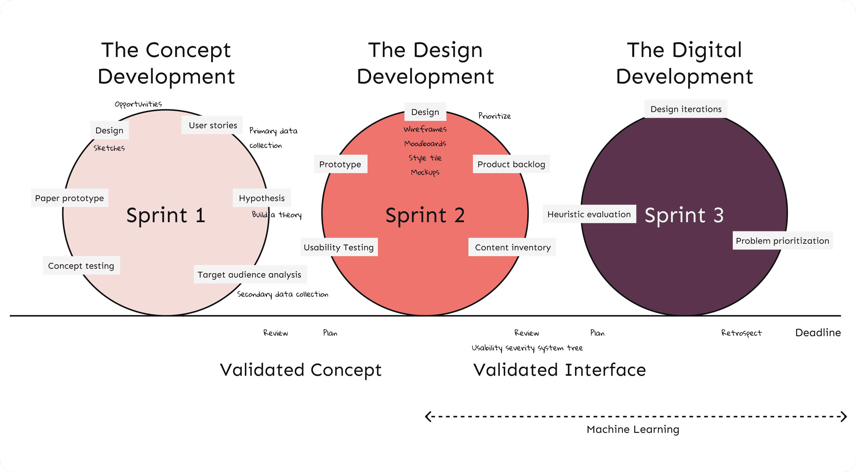
Sprint 1: Concept Development
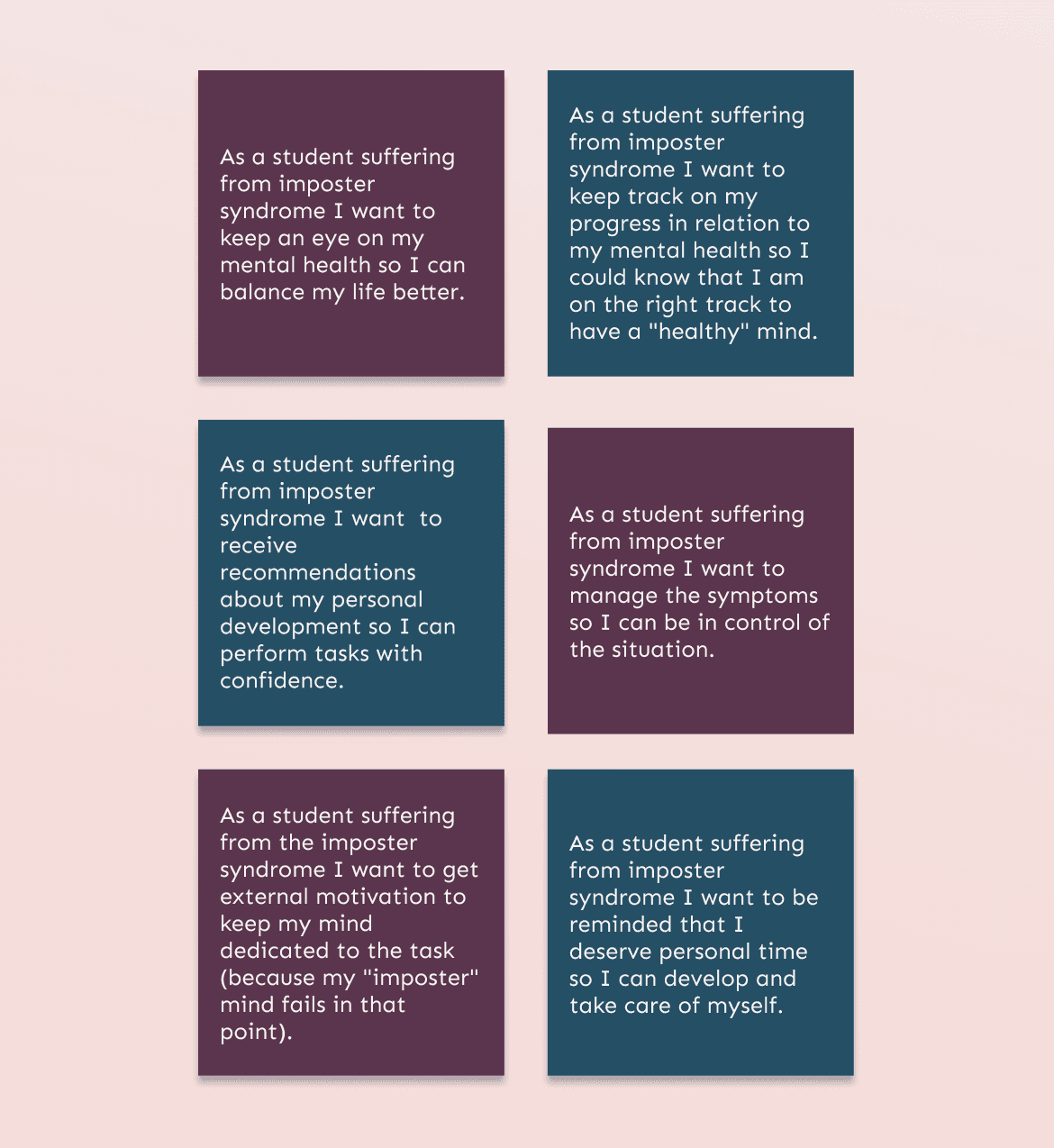
We mapped user needs into user stories, defined the value proposition, and created the first paper prototype to validate early assumptions.
Sprint 2: Design Development
We refined the experience flow, built mid-fidelity prototypes, and performed usability testing to validate comprehension and interactions.
Sprint 3: Digital Prototype + AI Training
We trained a machine learning model using IBM Watson Studio to predict IS type and intensity based on emotional check-ins and behavioral patterns.
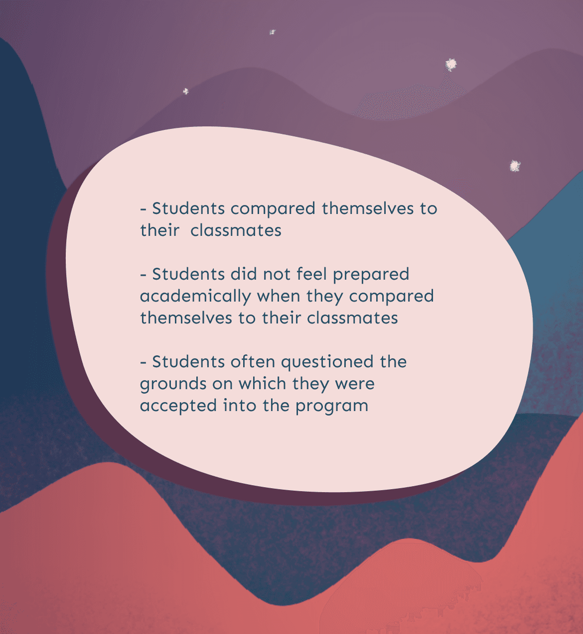
Key Insights
Core UX Decisions
1. Adaptive Check-ins
Problem: Students’ emotional states change rapidly, but existing tools are too generic to feel personal.
Decision: We designed a journal-like check-in flow that captures mood, environment, triggers, and context.
Why: These micro-entries fed the ML model, enabling more accurate predictions and tailored support.
Impact: Users felt seen and supported, not clinically evaluated, increasing trust and engagement.
2. Personalized Profiling (AI)
Problem: Students often don’t understand their IS patterns or how they shift over time.
Decision: We created a two-part AI flow:
A 5-question assessment that predicts the user’s IS type
Ongoing check-ins that update their IS level
Why: ML allowed the experience to evolve with the user rather than giving a one-time label.
Impact: Students gained clarity and language for feelings they previously couldn’t name.
3. Activity Recommendations with Behavioral Framing
Problem: Students wanted support but didn’t know what actions to take.
Decision: The home screen surfaces AI-recommended activities - grounding exercises, reframing prompts, self-kindness tasks, based on the user’s current IS level.
Why: This bridges the “I know I’m struggling but I don’t know what to do” gap.
Impact: Students reported feeling more empowered with clear next steps.
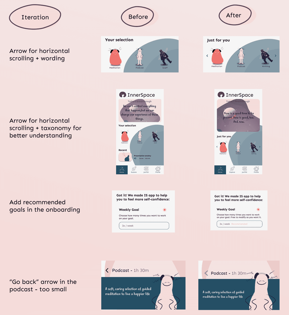
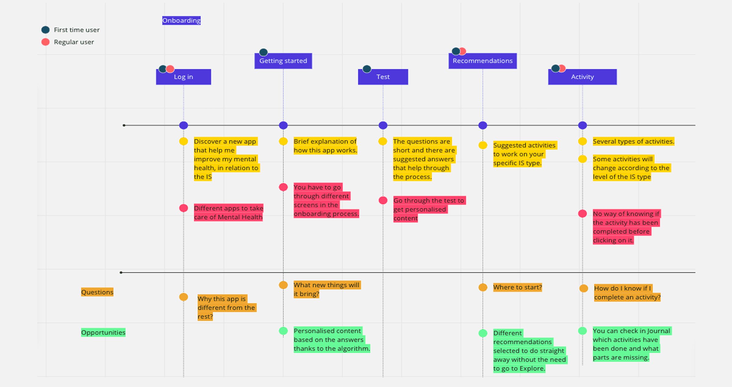
Testing & Iteration
Testing confirmed that while users connected emotionally with the product idea, they needed a clearer path through it. Some screens caused uncertainty, labels felt abstract, and the emotional tone needed more warmth and guidance. Through multiple iterations, I simplified the entry points, refined the language, strengthened visual cues, and made each step feel lighter and more intuitive. The final design reduced friction, made the experience more emotionally accessible, and better supported users in moments when clarity matters most.
Reflections
Acting as both UX/UI designer and Project Manager strengthened my ability to balance emotional sensitivity, emerging technologies, and structured teamwork.
I learned to:
design responsibly with AI
prioritize emotional safety in UX
adapt flows to user vulnerability
iterate quickly while aligning a multidisciplinary team
Most importantly, this project reaffirmed that design has power, not just to improve usability, but to help people feel seen, understood, and supported.