UX Case Study:
NATULIQUE
Academy
Digital platform for professional hairstylists to enhance their skills through online courses
- Individual Project
- Design Thinking
- 10 weeks
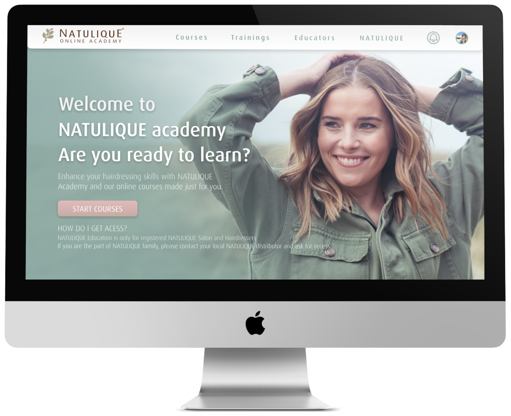
NATULIQUE Academy - Overview
The popularity of online learning has been increasing in past years. The hair beauty field has not been an exception. In fact, the hairstyling field is one of the most creative fields. It gives hairdressers opportunities to express themselves and make their customers happy at the same time. However, with this amount of creativity the field keeps changing day by day. The new trends come and go. The hairdressers need to seek ways on how to keep themselves updated to prevent the loss of clients. Therefore, they resort to online learning as one of the ways to keep up with the client’s demand.
That’s when NATULIQUE decided to step in and provide their hairdressers with an educational platform – NATULIQUE Academy. This platform aims to bring additional value to its users by strengthening the bond between NATULIQUE and their clients. This family bond creates an inspiring place where everyone aims to do their best and motivate others to do the same. However, the current state of NATULIQUE Academy doesn’t reflect these intentions and it still is in its beta version.
The Client
NATULIQUE ApS is a company established in Aarhus, DK in 1998. Since then, NATULIQUE has been a lighthouse for the movement of organic and sustainable culture within the field of the beauty industry. The company now operates in 50 countries worldwide and owns free brands that are entirely separated from one another:
The Audience
NATULIQUE hairdressers
The Challenge
How can I improve the NATULIQUE Academy website for the users in order to enhance their user experience when searching for the desired information and at the same time maintain NATULIQUE’s visual identity?
My Contribution
This case study is a summary of my final project from the AP program Multimedia Design and Communication at Business Academy Aarhus. This project was individual, therefore, I went through all the process stages on my own. Nevertheless, there are parts of the process that I would like to highlight in particular:
User Research
During the research, I mostly focused on finding the core values, needs, and pain points of the NATULIQUE hairstylists. To obtain them I put a strong emphasis on the user interviews. First, I screened the right candidates for the interviews following by preparing non-leading questions. Thanks to the insights from the interviews I was able to empathize with the users and understand what motivates them.
Information Architecture
Since the concept of NATULIQUE Academy is rather complex, I spent a generous amount of time figuring o the right IA that fits the audience’s expectations. To define that, I conducted rounds of card sorting exercises. Finally to detect potential flows I built a site map. That way, I was able to create the linking system. Additionally, it gave me hint for content features on all of the subpages.
UI Designer
In the role of UI Designer, I focused primarily on showcasing the values NATULIQUE and their hairdressers share. It can be also considered as a rebranding activity since the NATULIQUE design guide hasn’t changed since 1998. NATULIQUE Academy seemed like a good opportunity to first step for design updates.
NATULIQUE Academy - The Development Process
At first, I had to decide on the development method that will be implemented throughout the whole process. To ensure the human-centric approach during the process, I decided to use design thinking which serves as a great development method for complex and unknown problems. Furthermore, design thinking is a non-linear, iterative process that seeks to understand the users, define and reframe the problems in human-centric ways, and generate the best possible solutions within a short period of time.
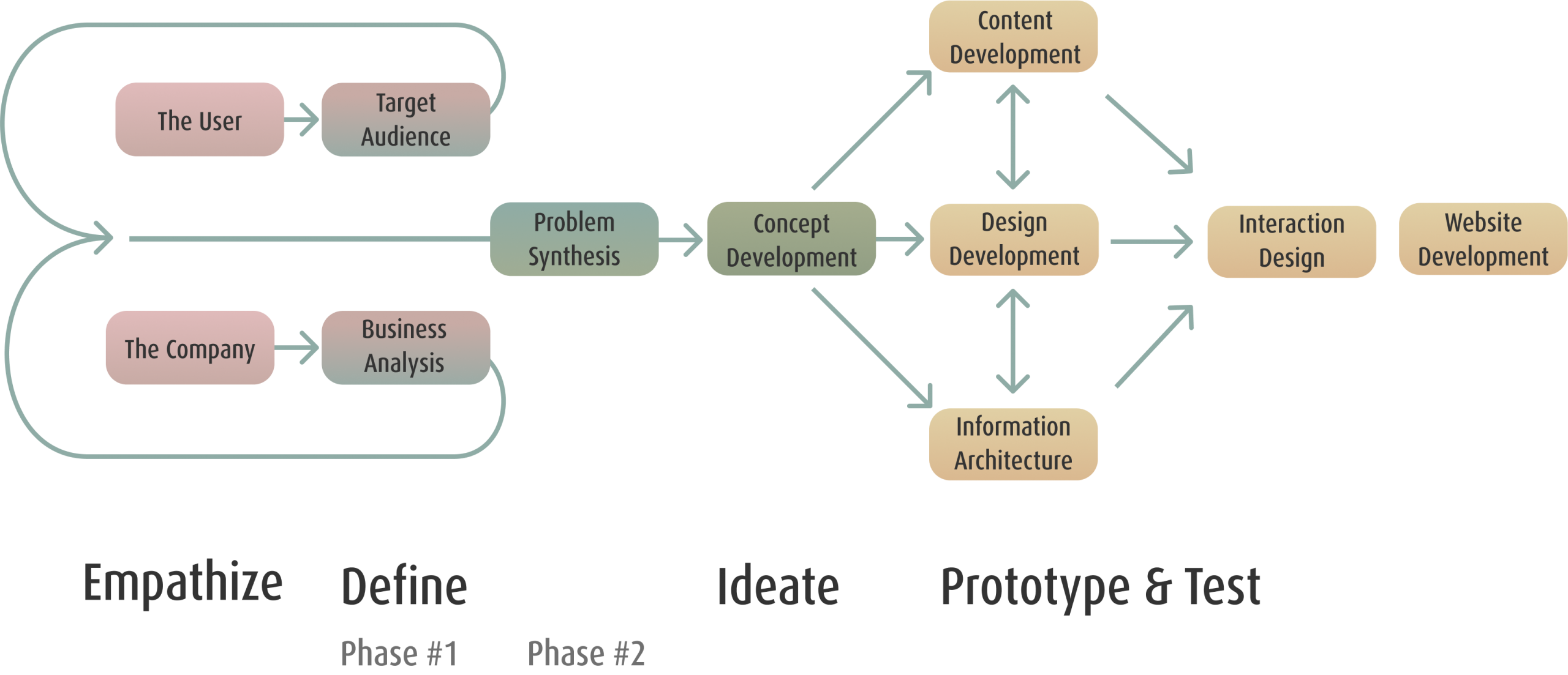
You can choose which part of the process you want to look into. Have fun!
Empathize
Company Research
Stakeholder Interview
The first step towards identifying NATULIQUE business goals was to conduct interviews with stakeholders. These interviews helped establishing the foundation of insights on the business that would have been difficult to obtain otherwise.
Before that, I had set goals to achieve and grouped them into 5 categories.

Business Goals
Nudge as many NATULIQUE hairdressers to have a profile on the academy website
Make users to enroll in courses and finish them
Bring additional value by inspiring hairdressers to learn, enhance their skills
Strengthen the NATULIGUE family bond Promote NATULIQUE products

Marketing
The website is poorly marketed now.
There is a FB group called NATULIQUE Hairstylists with more than 800 members
The website should be perceived as modern, educative with additional value.
Limitations
Limited target audience.
Wordpress plugins.

Web Competitors
TOP 5 - Simply Organic Beauty, Kevin Murphy, Oway, Original Mineral, Aveda.
Those platforms are not possible to access
Online platforms open for everyone - Skillshare, Udemy, etc
User Base
Distributors and Administrators who can create new accounts for clients who are dedicated to learning something new.
FB group - NATULIQUE Hairstylist (over 800 members)
Key Findings:
To conclude, I found out NATULIQUE would like to add more courses to the website. They aim to strengthen the NATULIQUE family bond by creating a place full of inspiration and appealing topics for the hairdressers. Also, it’s important to mention, the academy page is ONLY for NATULIQUE hairstylists to be used by. Talking about them, I got to know NATULIQUE hairstylists who are gathered on social media platforms.
Website Analysis
Heuristic Evaluation:
To evaluate UI design of the website, I decided to conduct a heuristic evaluation.
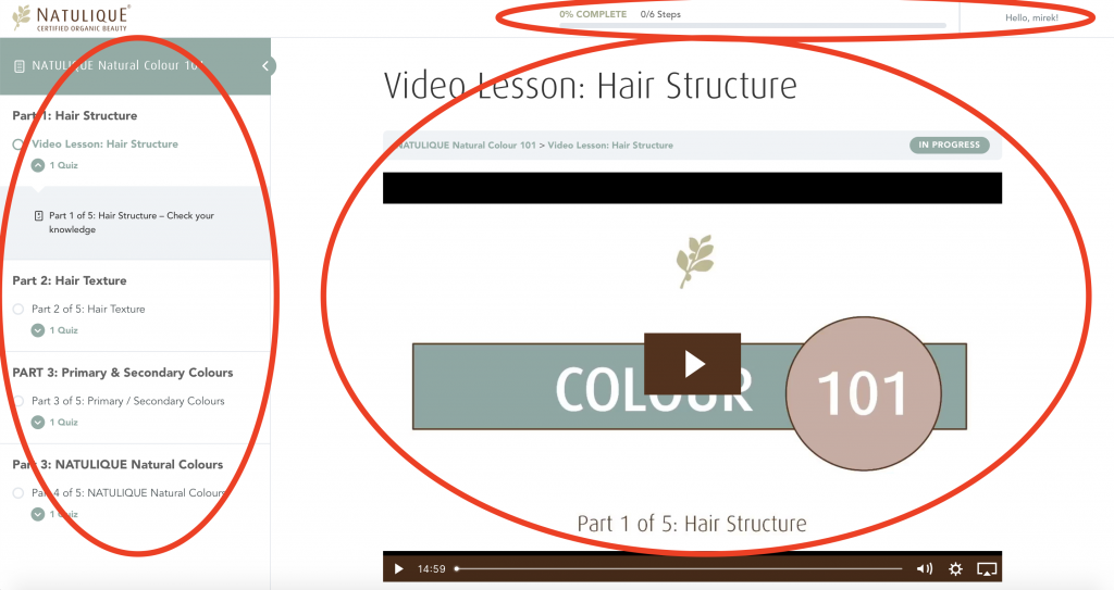
Firstly, the interface follows internal and external standards. Therefore, users should not have a hard time understanding the structure of the website and its content.
Secondly, the internal standards work with the same features in terms of choice of the typeface, colors, and ToV throughout the website.
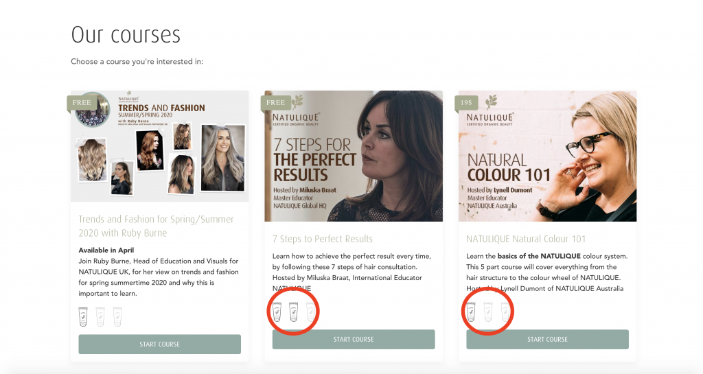
The interface:
- uses a plain language the hairstylists understand but might not be persuaded by
- uses design elements e.g. illustrated products which users purchase and have in their salons
- applies colours which NATULIQUE hairstylists are familiar with due to their previous interaction with the primary NATULIQUE website.
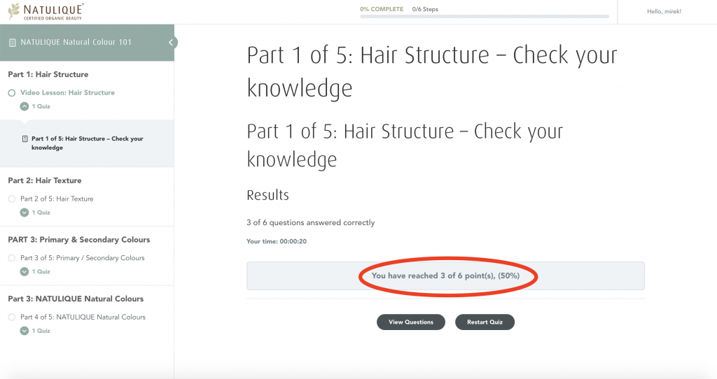
The nav bar provides its users with where they are currently located. However, when scrolling, there is no indicator of where the users are at. Within the course, there are multiple indicators that communicate how far the user is, what lesson they are currently watching or how far the system is in evaluating their answers. Also, the system gives opportunities on how to interact with the interface furthermore.
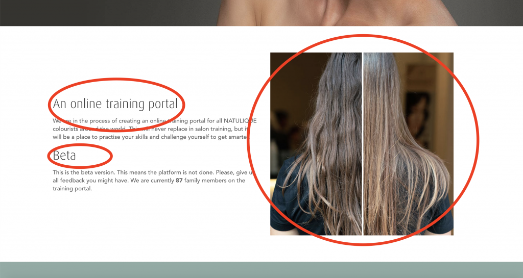
Design-wise, the interface is clean by using white space and consistent design elements. Every element communicates with a user and has its function. There are no elements that would work “just” as decorations with no meaning. Therefore, there seem to be no distractions that could cause misunderstandings. All information is clear and understandable.
On the other hand, the content might not match users’ expectations. Lastly, It’s clearly stated that the website is a beta version, meaning incompleted.
Key Findings:
As a result, I got to see some major and minor usability problems the website has. The heuristics helped me to highlight these problems:
Neutral content
Unfinished and empty website (stated on the main page)
Unclear instructions in the courses
In addition, I built the hypothesis that the website lacks personality. Even though it communicates with users with a plain language, they understand, the content might not be persuasive enough to enhance users’ motivations to enroll in the courses.
5-second test:
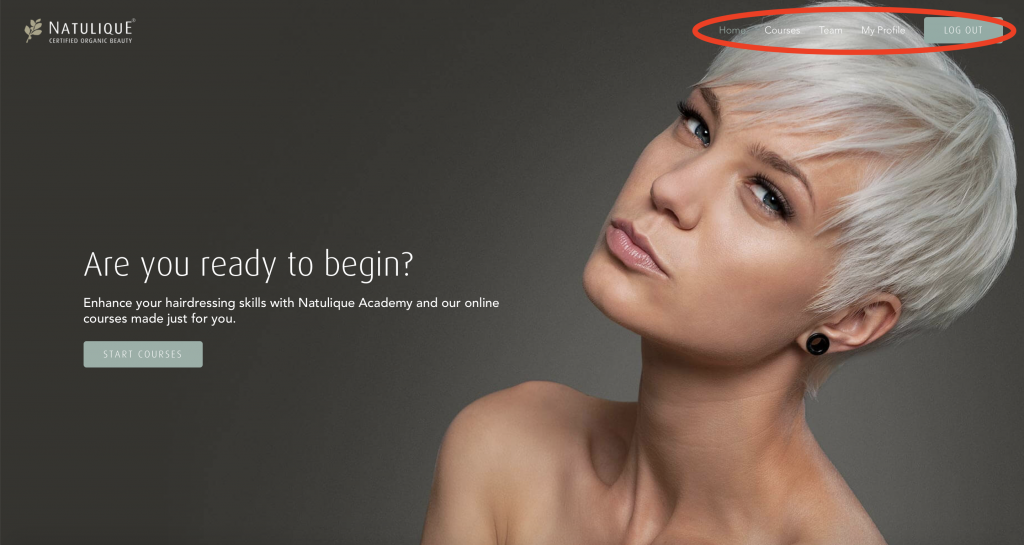
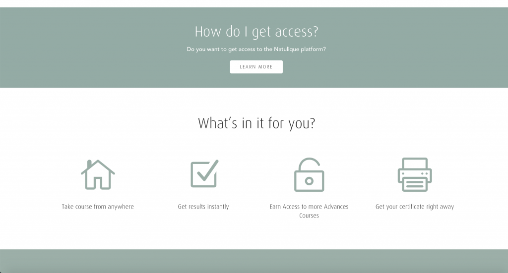
As a reaction to the hypothesis that I came up with, I conducted a 5-second usability test to confirm/ falsify my assumption.
The results showed that the focus of the website was easy to spot – 4 out of 5 participants said the website focuses on the cosmetic/ hair industry and 3 out of 5 participants mentioned learning courses due to the guidelines in the second half of the website. In regards to the look & feel of the website, 4 out of 5 participants said the website looks “neutral with a lot of empty space but maintains a professional vibe”. Two of them also mentioned that the vibe is a bit futuristic and modern due to the picture above the fold.
SoMe Analysis
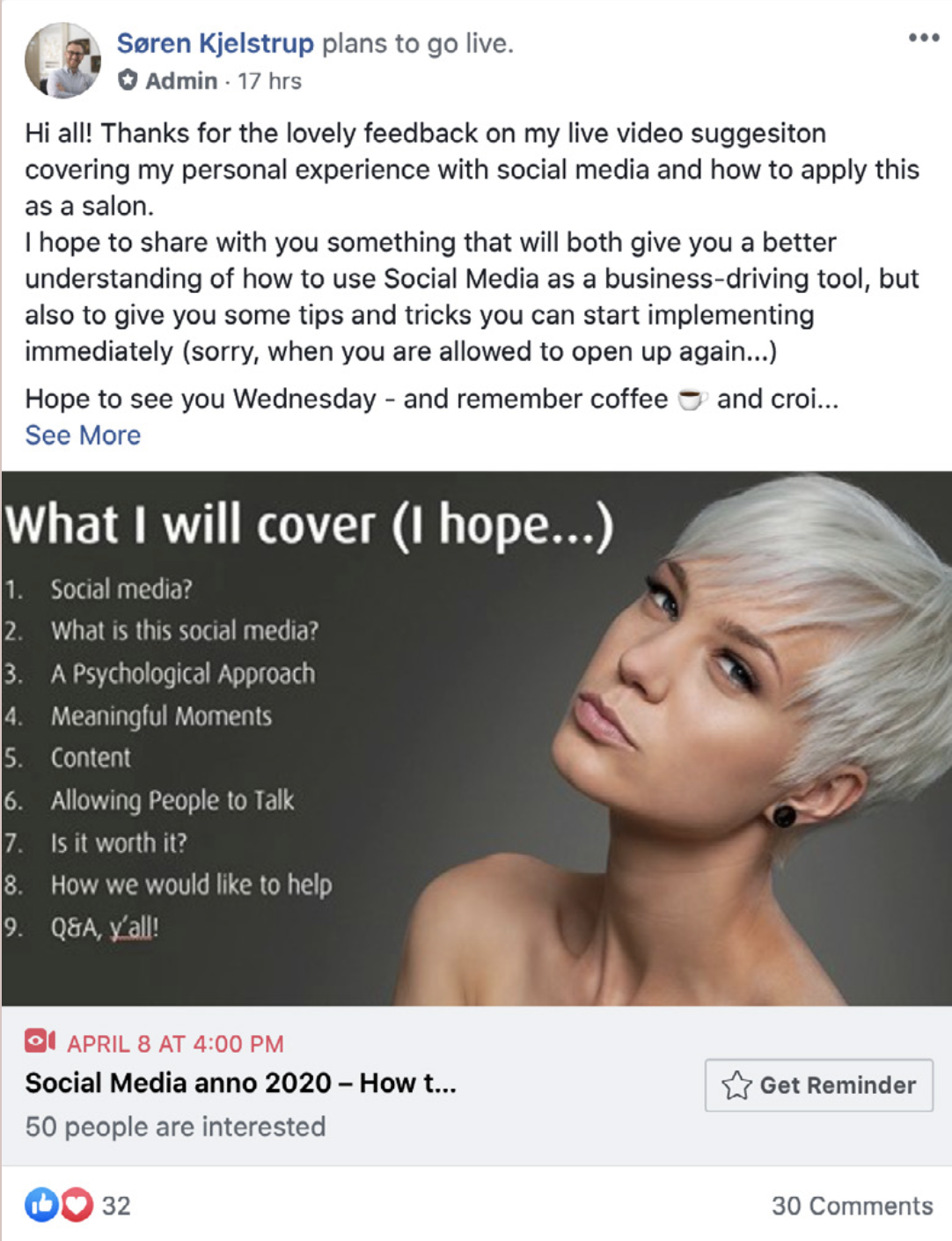
The main website is present on SoMe platforms such as Facebook, Instagram, YouTube, LinkedIn, and Pinterest where the content is visible for a wide audience. However, since the NATULIQUE academy page is only for a limited audience, the SoMe presence relies only on an international Facebook group.
The analysis showed that within this FB group, the communication happens inter-personally. No corporation account is being used. However, NATULIQUE representatives communicate via their own profiles. In that way, NATULIQUE can be closer to the clients, show their real selves, and support a friendly atmosphere.
In addition, the analysis uncovered the common loyalty NATULIQUE hairdressers share towards the company. It helped me to understand their genuine motivation which I will explore more during user interviews.
Competitive Analysis
Select the competition:
Firstly, I targeted both direct and indirect competitors in order to cover both ways users might go through instead of coming to the NATULIQUE academy website.
Direct competitors – Brands focused on professional natural hair products – Aveda, Simply Organic Beauty, Kevin Murphy, Oway, and Original Mineral. These brands have their own educational programs.
Indirect competitors – online platforms open for a wide audience – Skillshare, Udemy, etc.
Defining assessment criteria:
Secondly, I created the assessment criteria and rating system by which I evaluated the websites.

Start reviewing:
Thirdly, I evaluated the competition together with the NATULIQUE academy website to assure cohesive results.


As a result of the analysis, I found out the NATULIQUE academy page has the worst total score in comparison to every important competitor. Moreover, the platforms of the competitors were consistent in terms of design and user-friendliness when it came to the number of content features such as:
clear instruction and information about educators, lessons, and the overall purpose of the website
ease of browsing and navigation in and between different lessons – filters, recommended lessons, clear hierarchy, buttons to save or share the lesson, etc
consistent design throughout the websites that supports the overall look & feel of the brands identity
User Research
SoMe Analysis
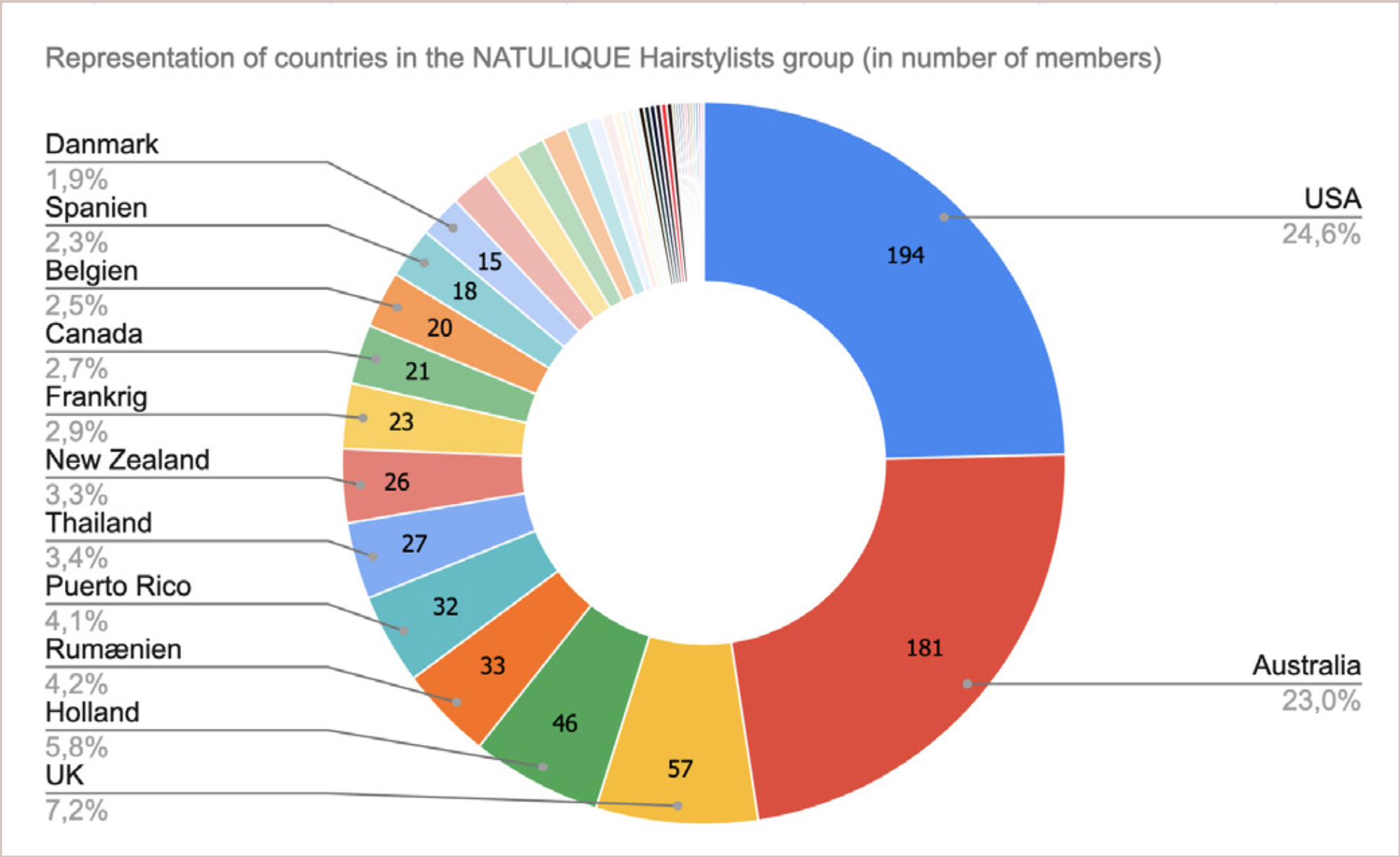
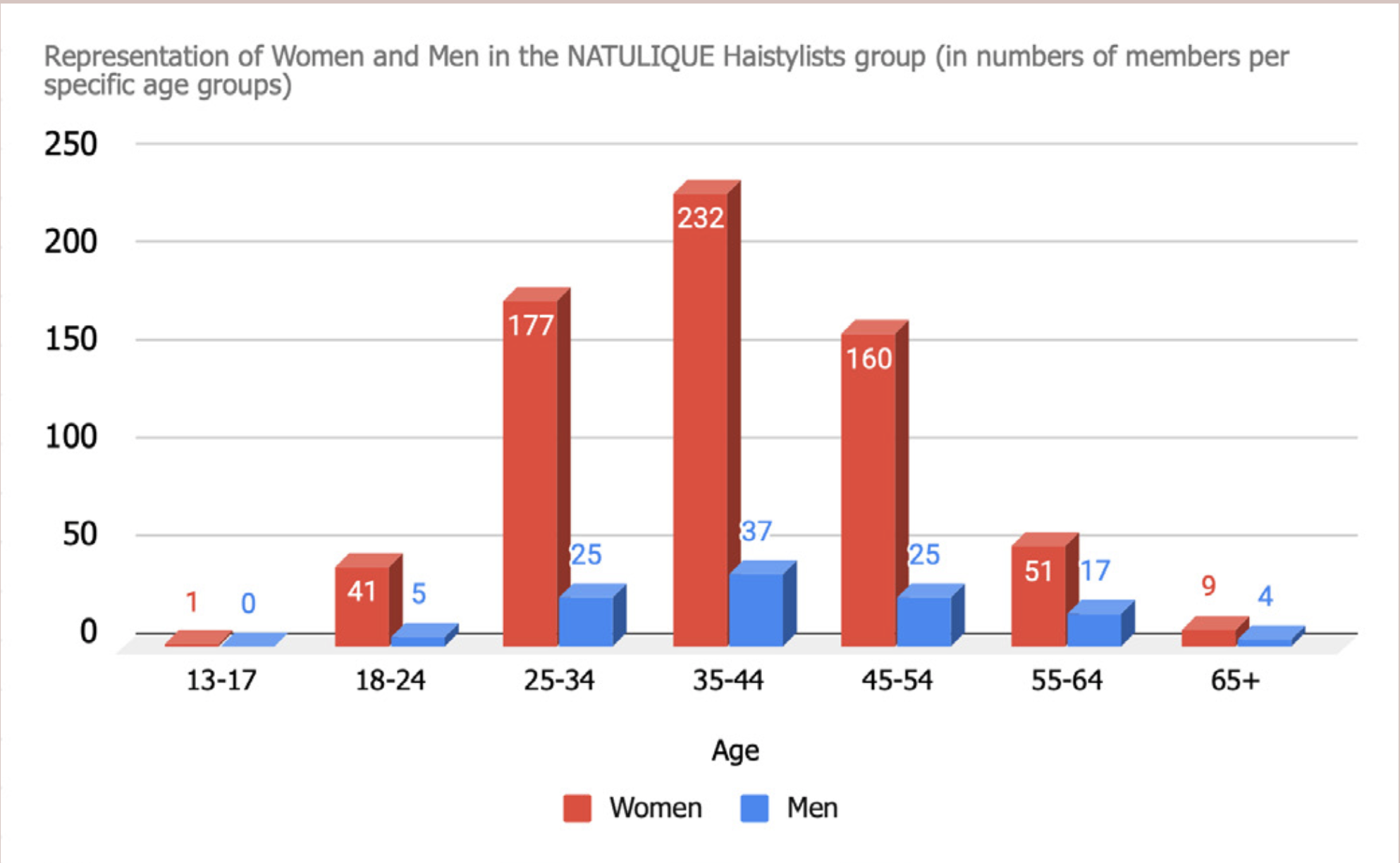
In order to look into the demographics of the target audience, I analyzed the NATULIQUE Hairstylists, by using Facebook Group Insights.
This tool helped me to uncover that the group consists of 85,6 % of women and 14,4% of men. They are mostly between 35-44 years but with a balanced representation of age groups between 25-34 and 45-54 years. In addition, the USA, Australia, and the UK are the countries where the hairdressers are primarily located.
The activity of the group members performs approximately 15 posts per week. The engagement (measured in likes and comments per post) depends on the post’s purpose. For instance, before and after images have higher engagement than posts where hairstylists ask for advice.
In addition, the atmosphere of the group is friendly and energetic. The hairstylists cheer each other up. Moreover, they share their tips & tricks with others and they ask for help if necessary. After that, I created an online survey for this audience.
Online Survey
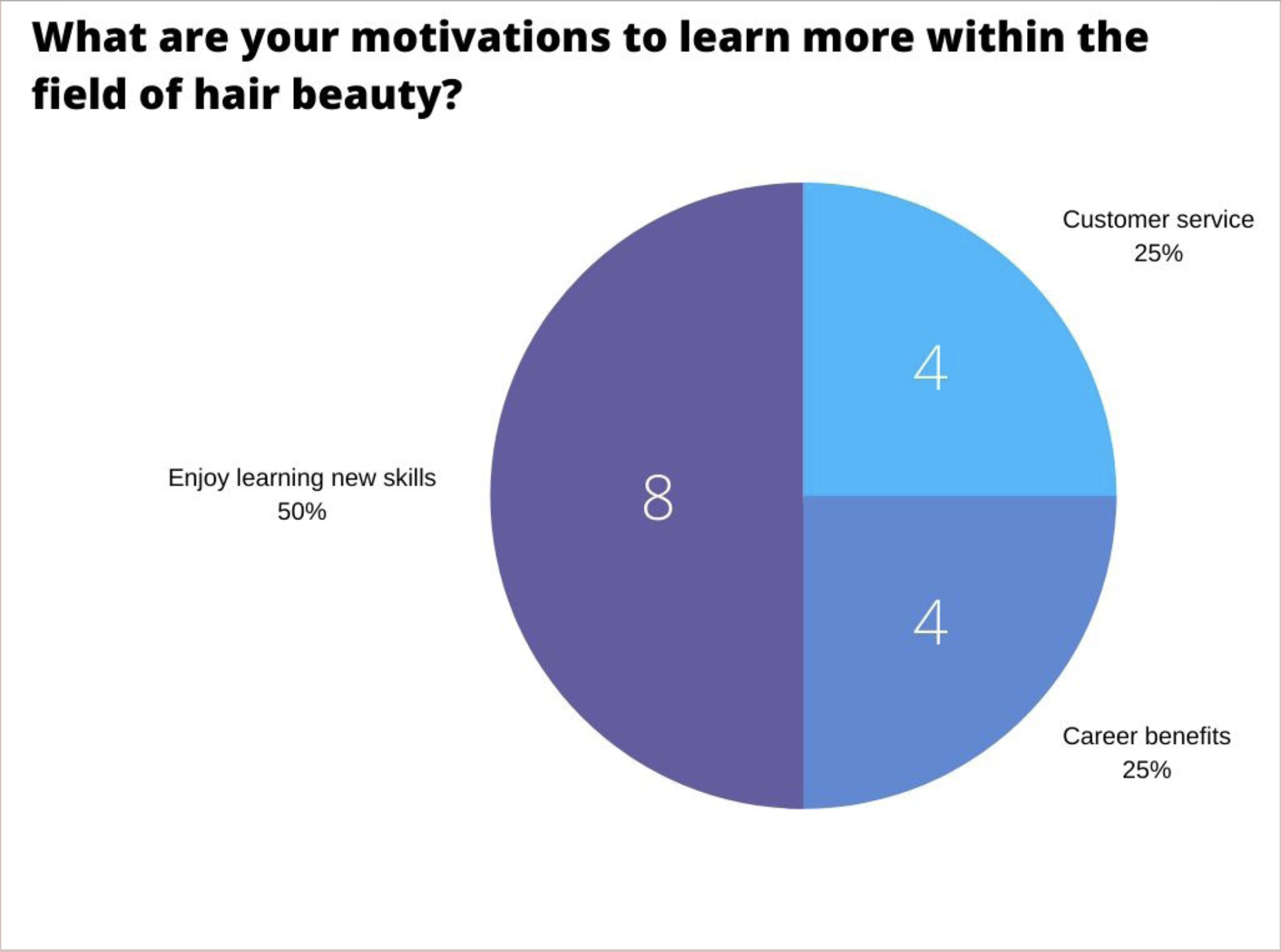
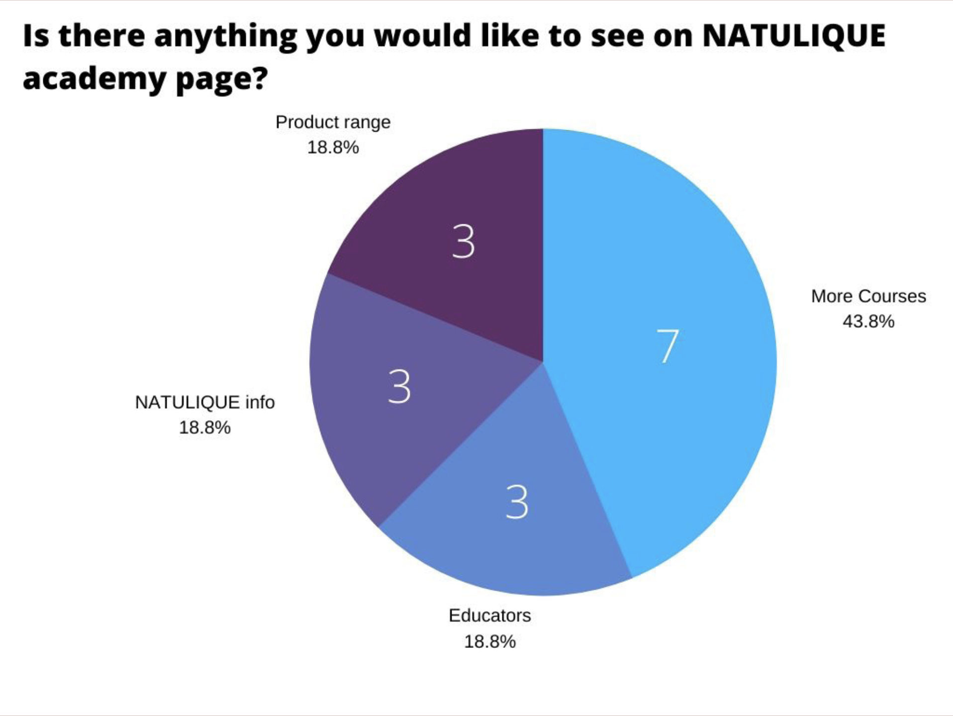
I used a combination of open and closed questions which provided me with a combination of quantitative and qualitative data. Furthermore, the survey was focused on the hairstylists’ motivations for learning, what learning courses they prefer, their so- far experience with the website as well as filtering out what topics they are currently the most interested in, and for how long they have been using NATULIQUE products.
The survey showed the vast majority of NATULIQUE hairstylists hadn’t signed up for the academy platform yet then. They did show interest in learning topics focused on digital salon, product knowledge, new techniques, etc though. However, more than online courses, the hairstylists prefer to attend hands-on workshops.
From learning formats, they prefer videos and articles the most. On the website, they would like to see more courses and information about the educators, product range and NATULIQUE.
Last but not least, they would sign up for the website for educative reasons.
User Interview
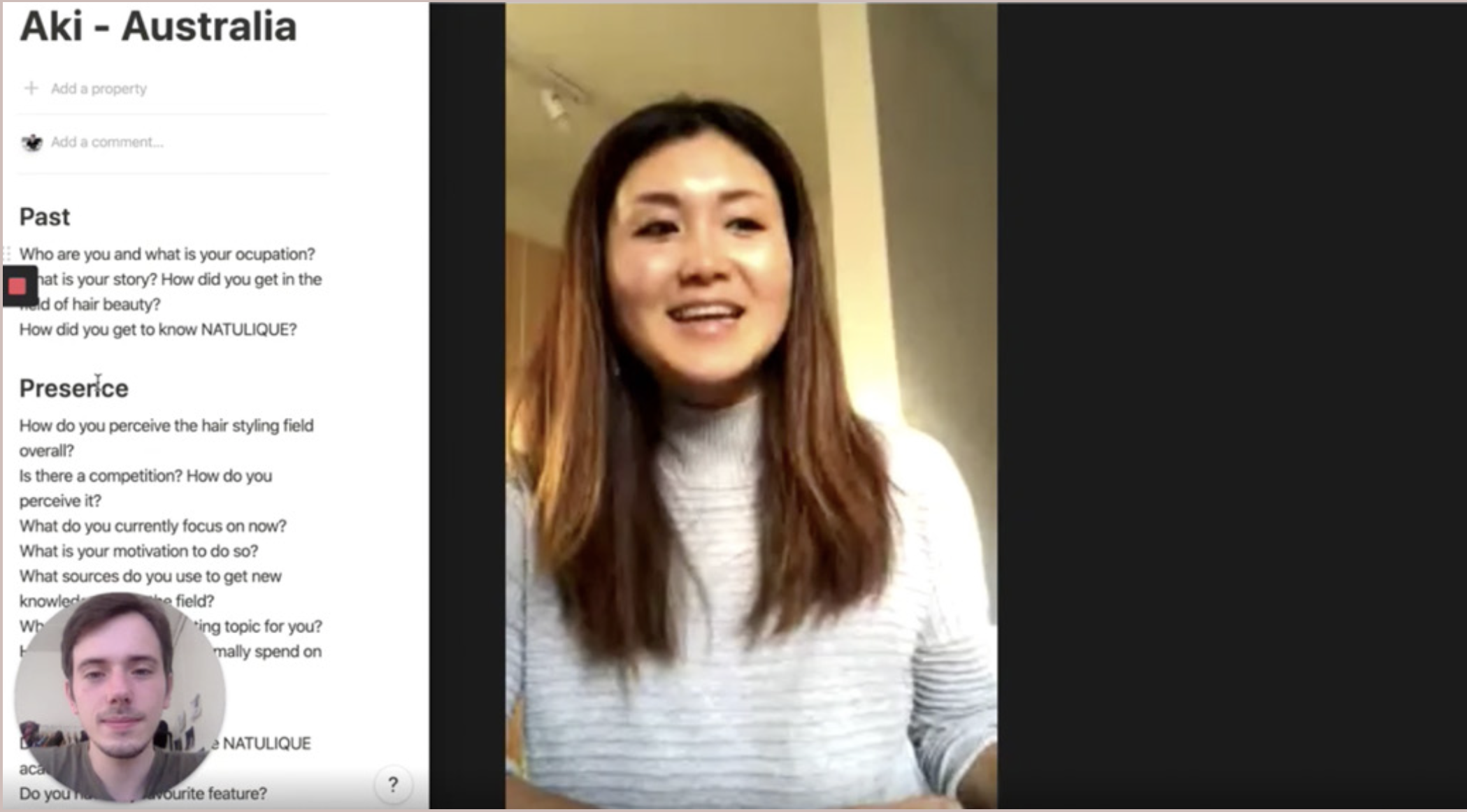
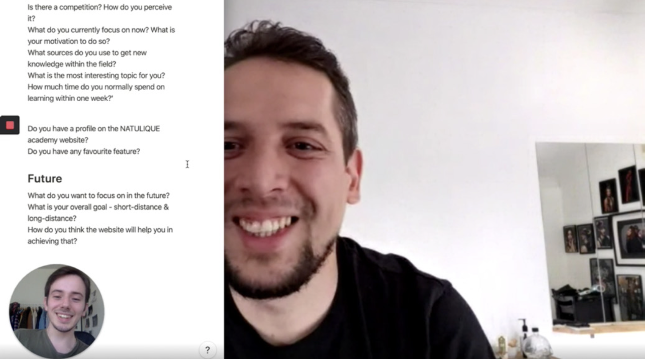
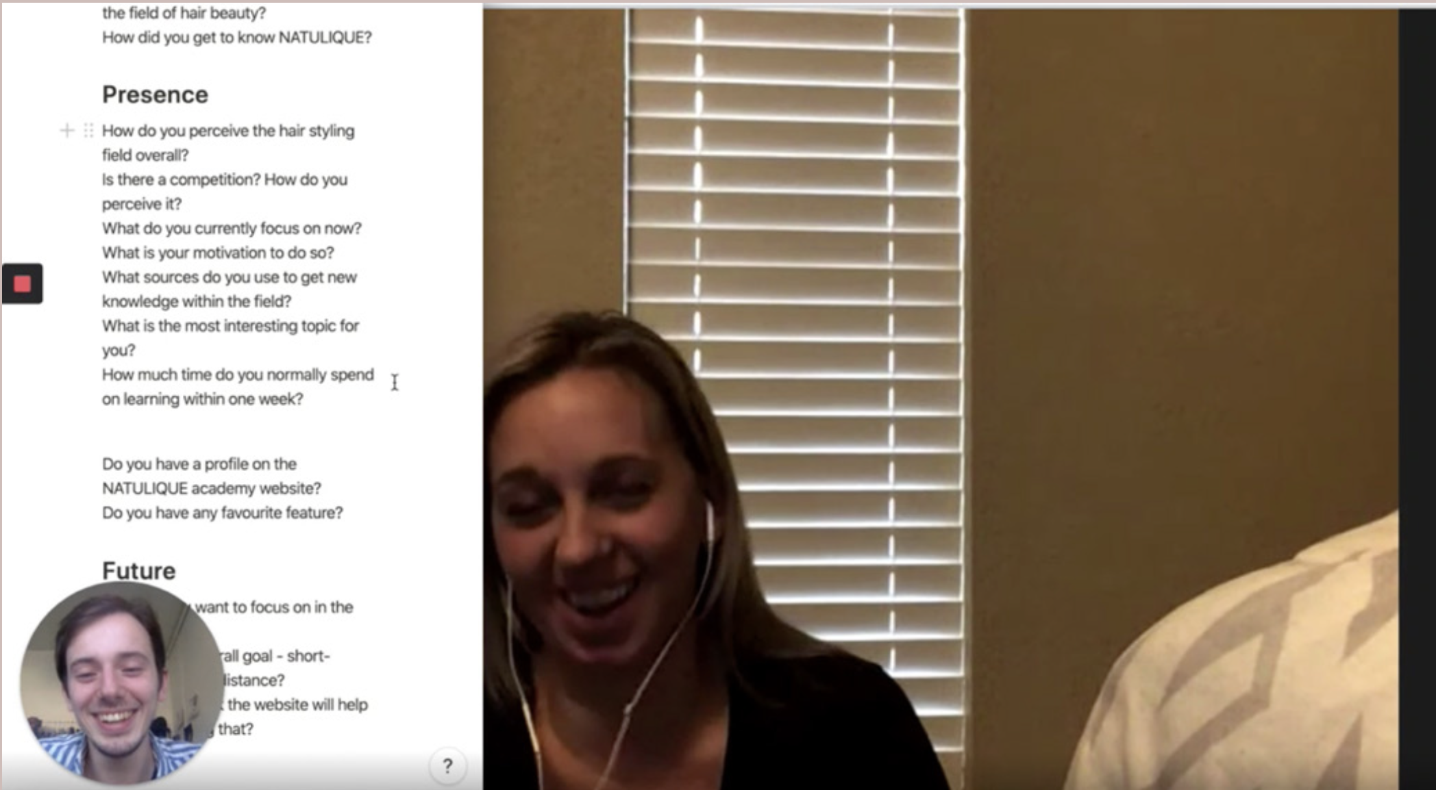
To dig deeper to users’ motivations, I decided to conduct user interviews.
First, I picked 5 representatives of the target audience who matched the demographics from the previous steps – 35-44-year-old from the USA, Australia, and the UK.
Second, I prepared non-leading open-ended questions for conducting semi-structured interviews to let the participants be outspoken.
All participants had been working within the hairstyling field for a while. However, there were differences in approach when it came to age groups. Two of them had already been salon owners. After a few years of managing the salon, they decided to take a step back and manage their own one-man salons. On the other side, three of them have dreamt about having a salon one day.
Younger participants mentioned that they would need to learn because they hadn’t been feeling as confidently as they would like to be. On the contrary, older participants want to learn because they wish to keep up with the younger generation and trends.
In conclusion, the user interviews truly allowed me to dive into the user’s motivations. The interview participants got to express their stories and passions which was inspiring for my process.
Define
In order to summarize all the business insights about the NATULIQUE academy website, I decided to use SWOT and TOWS analysis.
The SWOT analysis revealed that NATULIQUE is a company with passionate clients who are determined to learn. They are also involved in the worldwide conversation which takes place on social media. NATULIQUE has also skilled educators on their side who are ready to share their best practices.
On the other hand, the academy pain points are the empty and unfinished platform with hazy user flow. Additionally, the platform is poorly marketed towards the target audience and ignites a low number of signed-up users.
As for opportunities, they can work as reversed weaknesses. The platform can bring joy to its users by providing them with a visually pleasing website and explicit educational content focused on wide topics in order to strengthen the NATULIQUE family bond.
In the worst scenarios, without implementing opportunities, the platform risks gaining unsatisfied users which could cause the loss of their interest in the platform.
The TOWS synthesis was also primarily focused on the website and its internal environment without including the external part.
Using the strengths to benefit from NATULIQUE opportunities, the NATULIQUE academy can present currently popular topics, led by skilled educators to promote NATULIQUE products in the best possible way and satisfy the demand of highly dedicated clients.
In order to avoid the neutral “look & feel” of the website, NATULIQUE can revive its visual identity to set the right start for a pleasant user experience. To nudge the users to sign up for the website, NATULIQUE needs to promote it effectively and provide the users with explicit and easy-to-understand information.
Lastly, the website needs to be finished and filled with valuable content to avoid disappointing user experience.
As the ending point for the company analysis, I synthesized the data and created a company profile. It is a brief collection of all the essential information about NATULIQUE.
The company profile represents the same thing as the user persona represents the user’s behaviors, triggers, and goals. In this way, the company profile shows off the company’s business objectives, strengths, and weaknesses, SoMe behavior, etc.
Target Audience
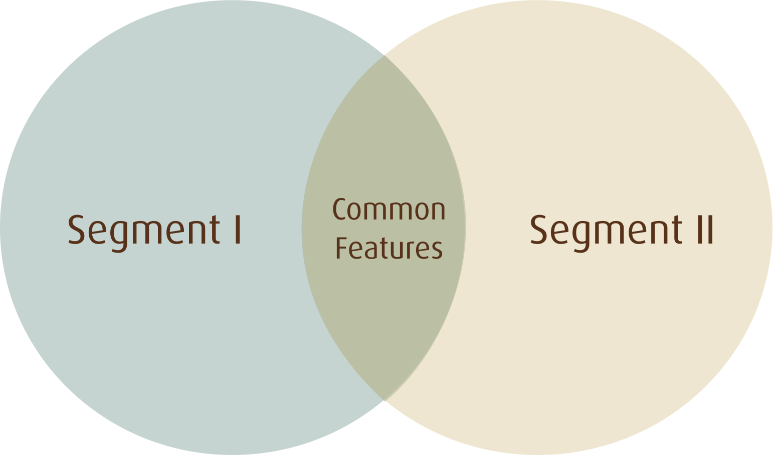
Looking at the user’s perspective, after considering the details of the audience I split the target audience in to two segments.
Older & Experienced Hairstylists
Mostly women between 35 and 44 years old but can be older (45-54 years old) who have approximately 15 years of experience or more.
They have experienced different occupations and these experiences influenced what they want to focus on now. During the time when they were studying hairstyling, the hair industry was way different and less digital. Now, these hairstylists need to catch up on current trends and learn how to promote their salons digitally.
They know the NATULIQUE products, yet they lack the information within new trends and techniques.
From the website, they expect interactive courses on current trends, so they could keep up with the market and enrich their knowledge.
Younger & Fresh Hairstylists
On the other hand, we have the younger generation – mostly women between 25 and 34 years old.
They actively promote their results on their social media channels and overall, it feels more natural for them to do so.
However, they need to learn more about products, what they include and how to use them properly. Also, the younger generation lacks experience, so building complex thinking about the products is something they still need to develop.
From the website, they expect more technical knowledge about the products and the NATULIQUE feel to be present as well as information about educators.
Even though these two segments of the target audience have different levels of experience and different work approach, there are features that unite both of them.
Overall, NATULIQUE hair stylists are passionate about what they do and they share the same motivation – to make people happy. All NATULIQUE hairstylists are also very much aware of their impact on the environment. They like challenges and they are eager to embrace their skills and express their creativity.
For learning, they expect different types of content and they expect the same from the website. All of them would like to see more courses on current topics and an opportunity to share their knowledge with others.
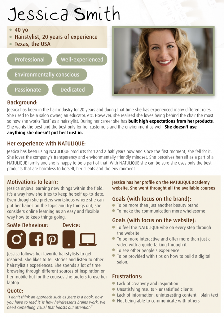
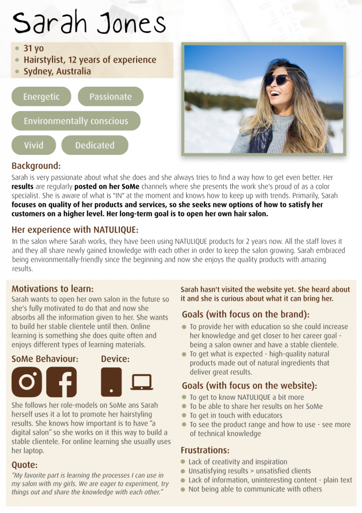
Moving to the final step of user research, I generated user personas as representatives for both of the target audience segments.
Empathy Map
After user personas, it was time to map the user experience with the product.
As I was sorting out the insights for the empathy map, I was able to differentiate them.
The insights highlighted with yellow colour are directly connected to the website and its usability. The ones with blue colour are reactions to the yellow insights. The white ones are related to the overall experience.
For example, Sarah is not able to enroll in any courses because she already went through all of them. Therefore, she starts to seek other online inspiration. On the other hand, Jessica will be able to finish the most important feature for her. Even more, she will print her certificate, and share her newly gained knowledge with her colleagues.
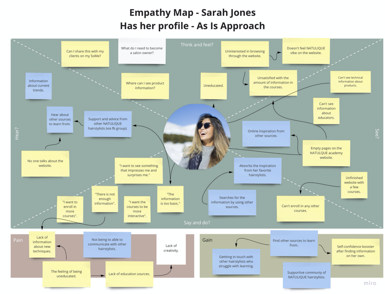
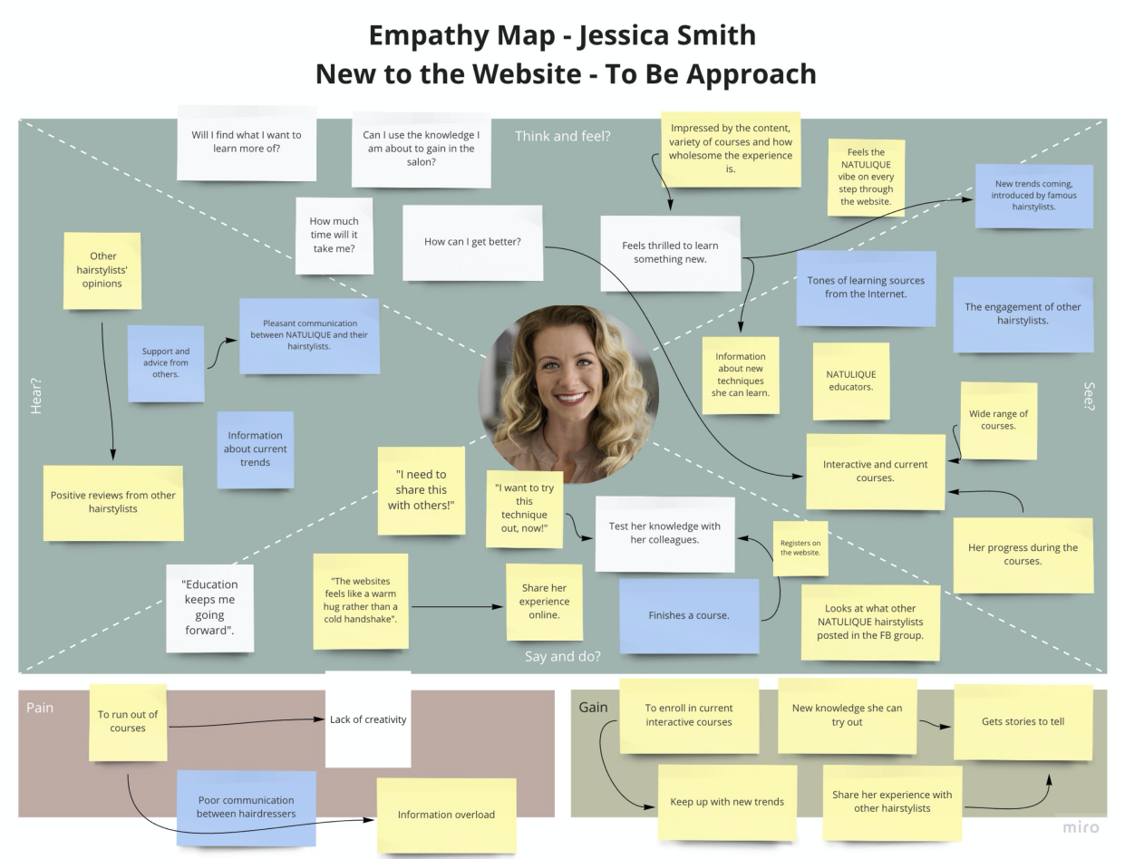
In the end, I was able to compare the current experience with the soon-to-be experience. It also helped me to get a wholesome overview of the experience and highlight specific pain points along the way of their interaction. Additionally, the empathy map brought me a deeper understanding of what the website can bring to the users on an emotional level – being an inspirational source with a supportive community of NATULIQUE hairstylists.
Problem Synthesis
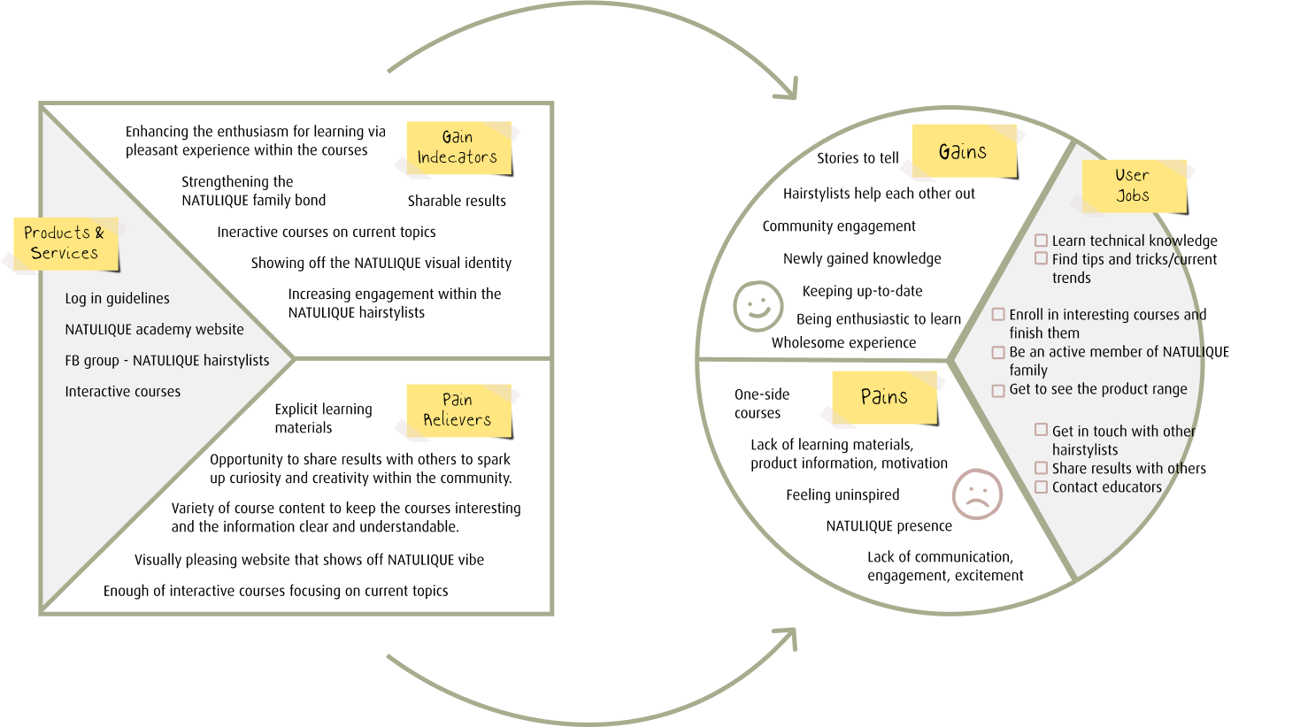
As a direct continuation of the empathy map, I used the Value Proposition Canvas. It operates directly with the company’s value proposition and customer’s pains and gains.
POV
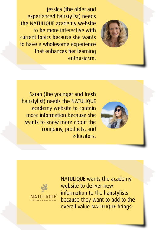
To address the right challenges for the development part of the project, I decided to use the Point of View exercise.
Point of View reframes the problem in user-oriented manners by focusing on the users, their needs, and the insights about them.
The POV exercise served me as a handy generator for additional questions related to the problem statement.
Last but not least POV narrowed down the focus that inspired me during the ideation stage of the project.
Ideate
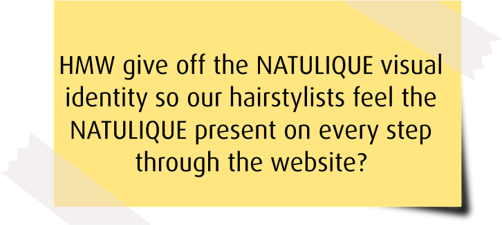
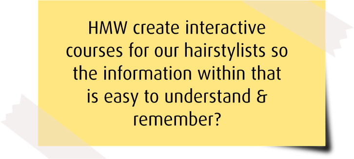
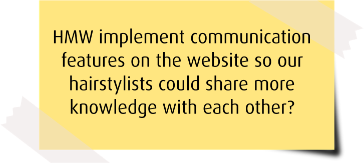
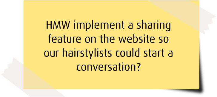
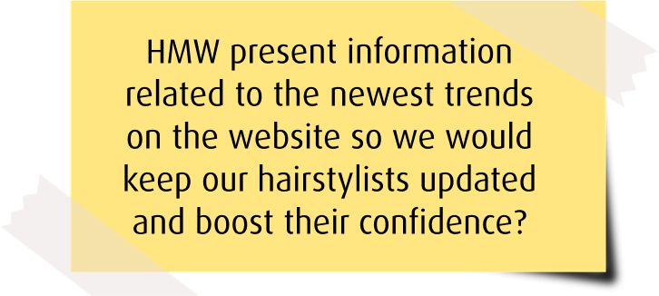
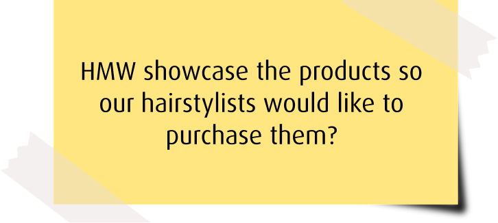
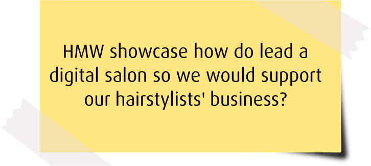
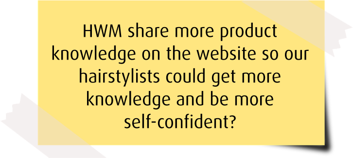
How Might We
Opening up the ideation process, I will use How Might We exercise.
HMW will serve as a conversation starter and provide me with a different perspective of considering the improvements for the solution.
UX & UI
SoMe & Communication

Website Content
Brainstorming
Later on, we designed the mockups according to the style tile that is displayed above.
By keeping the consistency of the colours and elements, we aim to bring a comfortable space as well as transmit safety and calmness for the user.
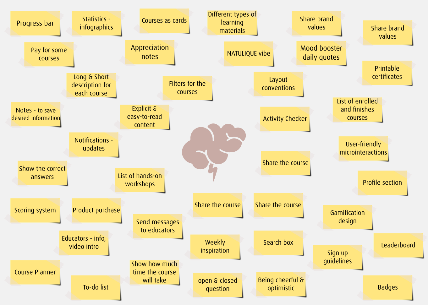
I used the Affinity Diagram not only for the idea gathering but also for defining the next steps of the process. As I clustered all the data, I was able to split them into 3 different categories: Website Structure, Design Development, and Content Development
Eventually, with these categories I moved to the prototype stage when I worked on them simultaneously.
Prototype
Card Sorting


As one of the stakeholders mentioned during the interview “hairdressers are not the most tech-savvy target audience”. In order to keep the solution user-friendly and easy- to-use, the website needs to be structured in a way it makes sense for the NATULIQUE hairdressers. Considering that, I achieve that by focusing on the navigation bar first before getting to the content placement.
As the first thing, I used an open card sorting to identify the navigation bar in the solution. Open card sorting frees its participants to organize the topics and put them in order based on their expectations
When the main navigation in the solution was defined, now I am going to decide upon the content placement within the solution.
Card sorting sessions were conducted with 5 participants who helped me to structure the website’s navigation bar + content.
In the results, I found similarities between the users’ needs and participants’ priorities.
For instance, the online courses should be placed first in the navigation bar since the overall concept of the platform relies on them.
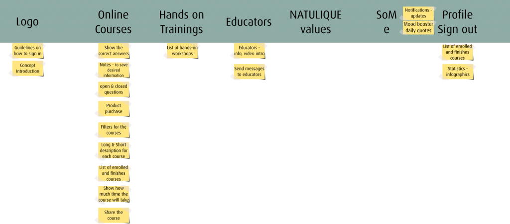

Site Map
The internal links will work both sides when navigating between the pages contained in the main navigation bar, whereas navigation from their subpages ( the course page and the homepage) will work only one-sided if the back button is not being used.


